
Winning Data Journalism in the COVID-19 Era
There may be no more important tool than data to guide leaders' responses to the pandemic, but it can be hard to make sense of a lot of information at once. Visualization can help us to understand data and identify trends.
It's also important to communicate public health information clearly to the public. In many instances, visualizations can show complicated statistics more clearly than can be explained with words. What follows are a few recent graphics that we think are especially successful at presenting data.

Front Page of the The New York Times Print Edition, March 27
Bar graphs are simple, but this chart of unemployment claims helps us to understand the magnitude of the economic challenges we face.
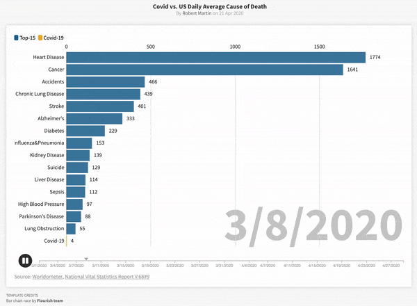
COVID-19 versus Daily Average Cause of Death
This animation from Flourish shows how COVID-19 overtook heart disease and cancer as the leading cause of death in the United States in early April. Click through to see a full-size version of the graphic.
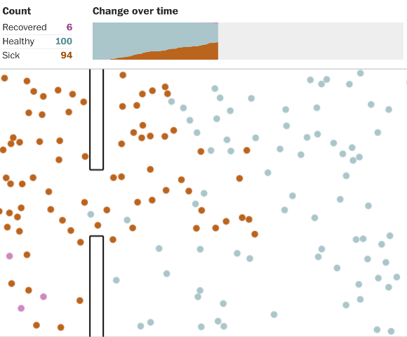
Why Outbreaks like Coronavirus Spread Exponentially, and How to “Flatten the Curve”
This interactive simulator is one of The Washington Post's most viewed stories, and it's easy to see why. It shows how disease spreads in an engaging way.
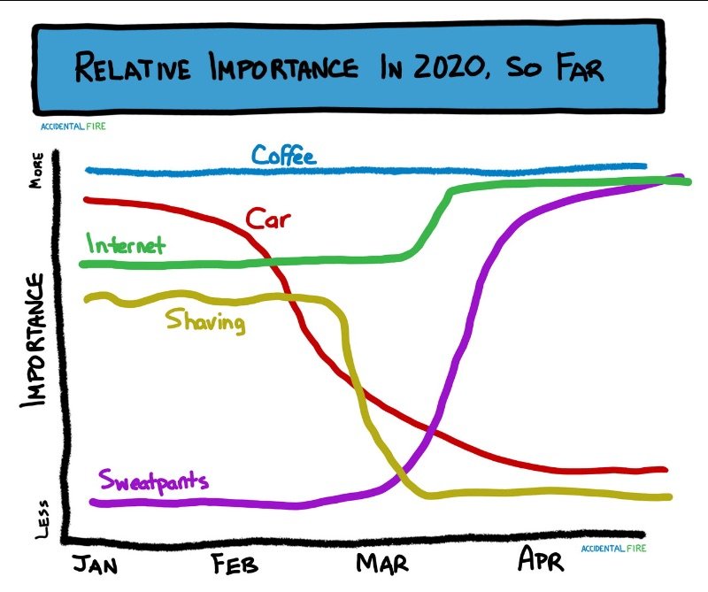
Relative Importance in 2020
It's fun, but we can also use visualizations to show how the pandemic is impacting every day life. For a more data-based example, visit Quartz for their analysis of how emoji use in Venmo has changed. It's surprisingly telling.